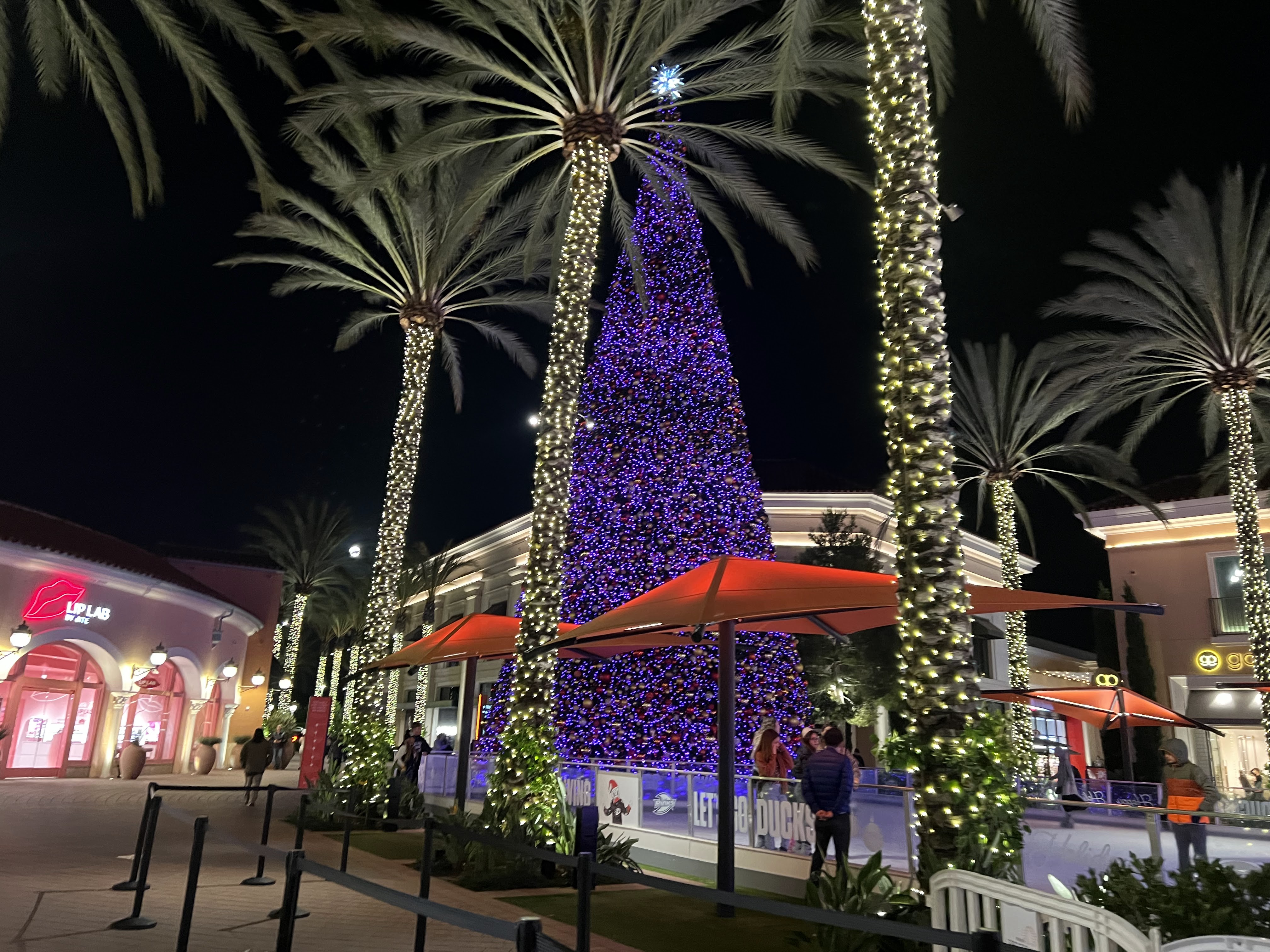
1. Since Christmas is coming up, the first picture captures the essence of the holiday especially since it's next to an ice rink. it definitely gives off the vibe and it presents it perfectly with the lights on the trees on the side and the big christmas tree next to it. It's in the middle of all the stores surrounding it as well so it does attract a lot of attention. i personally am not a fan of the purple color. although it does change color to a red and purple overtime, it's missing a variety of colors to show the holiday spirit.
2. This store is called Lip Lab. I feel like this store was very successful in the design on the interior and exterior. the color and overall theme is red and it's a strong energy that attracts the eye. it also has a white/cool light to support the red and blends the store into a pink design as well. There's also a big red lip LED light in the front store. It's simple and attracted me from far away.
3. This store is called Honey & Butter Macarons. There are plants displayed inside the store which attracted me but i would have to walk slowly and really look at it in order to notice it. There's a good amount of pink color and some blue LED lights inside but since the light is really dim, it's not enough to attract the customers. Although it could be their aesthetic but i don't think it was a successful design. i feel like it may need more white light to support the design and color of the store. The lights on the ceiling are a bit high but not enough to reach the floor or any objects in the store. For example, if a store is displaying shoes, you want to make sure the lights hit the shoes to highlight the colors of the shoes. You want to grab the customers attention when they walk by or from far away.


Thank you for your work on this. I enjoyed your observations on each image/area. It is nice to see you connect the lighting and decor to a story/brand and how it can pull us in, or push us away. Or, in the 1st image, just not complete the look. Nice post.
ReplyDelete