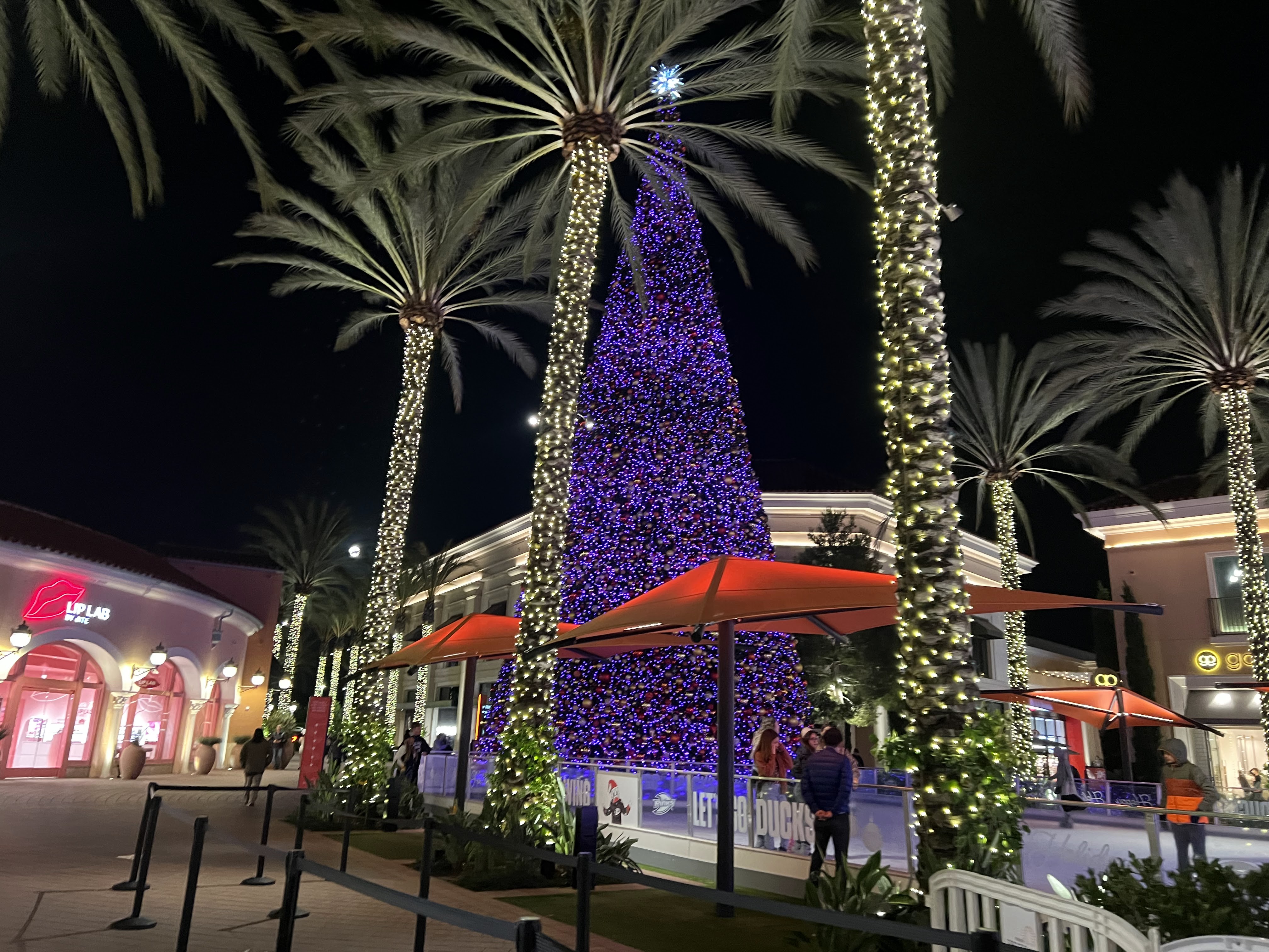
This is a picture of my plant. I have a big hobby of taking care of plants so I came to love cool lights that has over 1000 lumens. It's a very bright light that's beneficial for the plants to photosynthesize but also glows up the plants' beautiful green leaves. Since its a bright natural white light with 5000K, it immediately brightens up my room and especially on my plants that are used for decoration. The attention focuses on the plants.
Monday, November 28, 2022
Sunday, November 27, 2022
Ari- Week 9- Passion
While my friend and I were together looking for a match, we found this match connected at the top, it felt so special in the moment and represented our passion for each other that we wanted to share our drinks with the connected matches. The lighting was mid day with a lot of natural lighting giving the cool tones with the cool tone floor, The bottles both have warm tones reflecting the natural light into the scenery. My eye is able to get drawn to the warm tones due to this.
Week 9- danny- passion
Week 9 - Yellow Tree - Passion - Maggie
Week 9- Emily- Christmas Tree Glow
This is a picture of the Christmas tree I have in my living room. At the time I took the picture, it was the only source of light in the apartment and it created this soft and colorful pattern of light on the wall. The reflection of light off the ornaments sends the light through the shadows of pine needles, creating a gobo effect. The shapes on the wall remind me of stars twinkling- evoking a sense of movement. The light also creates a mirror image of the shape of the tree. I enjoy the contrast between the darkness of the tree and the lightness of its projection on the wall.
Thursday, November 24, 2022
Week 9 - Yinqi - Sunset - Passion
My choreographic inspiration always draws from nature. The sky can give me immense imagination and provokes my body to move. This picture captures the sunset. I especially enjoy the smooth transition from the dark pink at the bottom to the deep lavender blue at the top. Usually we think of the warm and cool colors as contradictions. But in this picture, the two colors are perfectly blended together. Emotionally it is neither a sense of melancholy nor an exuberant joy. This blended color balances the feeling. It makes me feel harmonious and profound. This deep sensation connects to my passion for dance. I like to create dance works that capture both tranquility and vitality. It is the distance between these two polaric feelings that makes me feel the depth of moving bodies.
Monday, November 14, 2022
Ari Pulido- W7- Site Specific
Although La Brea Bakery sounds like a cute shop, the outside of the shop seemed dark and isolated. The dark chairs on the night sky covers up much of the lighting that could be seen. The lighting is very warm and except for the red title, there is not much else to be desired. In a different location this Bakery could be successful with the lighting, but compared to the rest of Downtown Disney, I don't envision La Brea Bakery staying in business too much longer.
I can definitely say the pictures do not do Naples justice and the bar looked like a hip and fun place to be. The tile Naples is lit in a bright white lighting next to a dark background so the name can be seen from afar. The bar is open to the outside where all the drinks are lit of in an assortment of fun saturated colors. The bottom of the table was a bright light that contrasted the drink colors up above. When I passed by Naples, I wanted to sit down and have a drink myself.
Sunday, November 13, 2022
Week 7- Emily- Irvine Spectrum
Week 7 - Maggie - Irvine Spectrum
Saturday, November 12, 2022
Week 7 - Julian Xiong - Irvine Spectrum
1. Since Christmas is coming up, the first picture captures the essence of the holiday especially since it's next to an ice rink. it definitely gives off the vibe and it presents it perfectly with the lights on the trees on the side and the big christmas tree next to it. It's in the middle of all the stores surrounding it as well so it does attract a lot of attention. i personally am not a fan of the purple color. although it does change color to a red and purple overtime, it's missing a variety of colors to show the holiday spirit.
2. This store is called Lip Lab. I feel like this store was very successful in the design on the interior and exterior. the color and overall theme is red and it's a strong energy that attracts the eye. it also has a white/cool light to support the red and blends the store into a pink design as well. There's also a big red lip LED light in the front store. It's simple and attracted me from far away.
3. This store is called Honey & Butter Macarons. There are plants displayed inside the store which attracted me but i would have to walk slowly and really look at it in order to notice it. There's a good amount of pink color and some blue LED lights inside but since the light is really dim, it's not enough to attract the customers. Although it could be their aesthetic but i don't think it was a successful design. i feel like it may need more white light to support the design and color of the store. The lights on the ceiling are a bit high but not enough to reach the floor or any objects in the store. For example, if a store is displaying shoes, you want to make sure the lights hit the shoes to highlight the colors of the shoes. You want to grab the customers attention when they walk by or from far away.
Friday, November 11, 2022
Week 7 - Yinqi - Irvine Spectrum - Site Specific
Overall Environment: The lighting of the Irvine Spectrum creates a sense of modernity and fashion. The pinkish lavender color makes the whole environment glow yet still blends at night. The green and yellow add freshness and energy. It provides a futuristic sense. The coconut trees are decorated with and become the main sources of light sources.The light seems to reinforce the symmetrical structure of the architectural design. The different colors between the stores and the ferris wheel also frame and enhance the space (the former being rectangular and straight and the latter being circular).
Successful Store: I Think the Subway Store looks successful. It captures the brand’s signature colors: green, yellow and white. The LED lights sketch out the “S” shape on the window. And the background behind the Logo is mainly green. This design is not only eye-catching, but also gives me a feeling of health and swiftness. I think I can get some healthy, nutritious food from the store quickly.
Failed Store: The name of the store "KEVIN JEWELERS" upon the entrance is lit with cool bright LED light. I suppose the intention is to create a diamond like sheen, but it makes me feel like a sports store. In the store, All the down lights are hung on the ceiling, forming two rectangles. Though the similar lighting structure also appears in museums or art galleries (I guess this might also be the intention of these downlights? To make their product look like precious artworks exhibited in the counter), but the overall environment is too bright. The lights above, without being covered, turns the whole store into a poorly decorated warehouse. The lights within the counters also compete with other lightings in the room. The whole space looks a bit messy and cheap.
Thursday, November 10, 2022
Blog 7: site specific - danny
On November 12th I visited downtown Disney
The overall theme I saw was "old school America". It reminded me of movies where we can see small towns in the 1950s and 1960s where you can find everything you need by going along one main street. I saw a restaurant with live music and Louisiana food and decorations, toy stores, clothing stores, a burger joint and even some Christmas trees (less than a week after halloween)
I noticed that the stores with the least amount of people had white walls and white bright lights, usually the lights where hanging from above coming down on a straight angle and sometimes there would be some smaller lights focusing on the products. A specific store that suffered from is ironically Wonderground Gallery (it was not wonderful nor grounded at all). I think in this store the main theme is money: the designers most likely wanted to focus on the products and how expensive and unique they are.
I think this store is very successful at playing with size: the "toys" (lego statues) are huge and make you feel like a small child. The store was packed.
Week 9 - Julian Xiong - Passion
This is a picture of my plant. I have a big hobby of taking care of plants so I came to love cool lights that has over 1000 lumens. It'...