Monday, November 28, 2022

Week 9 - Julian Xiong - Passion

 This is a picture of my plant. I have a big hobby of taking care of plants so I came to love cool lights that has over 1000 lumens. It's a very bright light that's beneficial for the plants to photosynthesize but also glows up the plants' beautiful green leaves. Since its a bright natural white light with 5000K, it immediately brightens up my room and especially on my plants that are used for decoration. The attention focuses on the plants.


Sunday, November 27, 2022

Ari- Week 9- Passion


 While my friend and I were together looking for a match, we found this match connected at the top, it felt so special in the moment and represented our passion for each other that we wanted to share our drinks with the connected matches.  The lighting was mid day with a lot of natural lighting giving the cool tones with the cool tone floor,  The bottles both have warm tones reflecting the natural light into the scenery.  My eye is able to get drawn to the warm tones due to this.

Week 9- danny- passion

For this week's blog I asked myself: how to represent passion? The obvious answer would've been DANCE!
 I tried taking some pictures at the studio or in the Claire Trevor but It
 didn't feel like any of those pictures represented passion. To me dance is everywhere. I actually found myself dancing on my way to my car after a friendsgiving dinner at Emily's house. I stopped for a second becuase I though I was getting lost and I saw this emergency post. The light was very bright, it felt like it was shining a spot light on me. It felt like it was creating a stage for me to perform. To me dancing is my biggest passion and after taking this class I feel like I gained a bigger connection to that passion. 
I have a better understanding of the power of lighting. For example I always found it very hard to stretch at nights but now I just turn on my LEDs on blue and turn off the fluorescent light and I become very motivated, the world becomes cold and lonely around me and I can hear my breath and feel my body temperature. Whenever I want to focus on my homework I set the lights to the color green and that drains my energy so I become glued to my computer instead of be shifting back and forward. 
I had a lot of fun in this class and learned a so much, hopefully I can keep learning about lights.


Week 9 - Yellow Tree - Passion - Maggie


    This is a tree that I saw in the Palo Verde Housing, and the picture doesn't nearly capture the rich, saturated yellowness of the leaves! It was so bright under the street light against the dark night, and it stood out to me immediately. The vibancy was like the color of passion, and the tree felt to me that it was still growing and growing, its energy expanding with the shape of the branches and the bright color. 
    It was also a color that I really want to put in my New Slate piece, because there's something childish and happy about it. This color also reminds me of Wes Anderson's movies which have an innocent and even flirtatiously childish tone. 


Week 9- Emily- Christmas Tree Glow


This is a picture of the Christmas tree I have in my living room. At the time I took the picture, it was the only source of light in the apartment and it created this soft and colorful pattern of light on the wall. The reflection of light off the ornaments sends the light through the shadows of pine needles, creating a gobo effect. The shapes on the wall remind me of stars twinkling- evoking a sense of movement. The light also creates a mirror image of the shape of the tree. I enjoy the contrast between the darkness of the tree and the lightness of its projection on the wall. 

Thursday, November 24, 2022

Week 9 - Yinqi - Sunset - Passion

Week 9 - Yinqi - Sunset - Passion


My choreographic inspiration always draws from nature. The sky can give me immense imagination and provokes my body to move. This picture captures the sunset. I especially enjoy the smooth transition from the dark pink at the bottom to the deep lavender blue at the top. Usually we think of the warm and cool colors as contradictions. But in this picture, the two colors are perfectly blended together. Emotionally it is neither a sense of melancholy nor an exuberant joy. This blended color balances the feeling. It makes me feel harmonious and profound. This deep sensation connects to my passion for dance. I like to create dance works that capture both tranquility and vitality. It is the distance between these two polaric feelings that makes me feel the depth of moving bodies. 


Monday, November 14, 2022

Ari Pulido- W7- Site Specific

Downtown Disney


 Although La Brea Bakery sounds like a cute shop, the outside of the shop seemed dark and isolated.  The dark chairs on the night sky covers up much of the lighting that could be seen.  The lighting is very warm and except for the red title, there is not much else to be desired. In a different location this Bakery could be successful with the lighting, but compared to the rest of Downtown Disney, I don't envision La Brea Bakery staying in business too much longer.


I can definitely say the pictures do not do Naples justice and the bar looked like a hip and fun place to be.  The tile Naples is lit in a bright white lighting next to a dark background so the name can be seen from afar.  The bar is open to the outside where all the drinks are lit of in an assortment of fun saturated colors. The bottom of the table was a bright light that contrasted the drink colors up above.   When I passed by Naples, I wanted to sit down and have a drink myself.  


Sunday, November 13, 2022

Week 7- Emily- Irvine Spectrum

I visited the Irvine Spectrum for this site specific blog. The overall feeling was bright, inviting, and warm. The entire space feels carefully maintained and curated, especially in the way that lighting was integrated with architectural and landscaping designs. In this first picture, the  lighting gives enough sweeping ground cover to see where you are walking- a big contribution to the safety of shoppers. There are blue lights that complement oranges in the building design and define several zones in this area. The lighting in the palm tree zone accents their verticality and grandeur, while also drawing our attention to lit pathways on the ground. The blue lights also help in lighting up the archway to another section of the mall- guiding shoppers to the next destination. I think the lighting here is very supportive of the goal. With light, the designer has created a safe environment, that encourages movement through the mall.


This second image is of a shoe store specializing in collectible sneakers. I think this store did a good job of balancing the brightness of the white lights, necessary to properly display the color of the shoes, with the cool toned square in the center. The blue light has two functions: to give shoppers eyes a break from the harsh display lights, and to encourage the flow of movement around the perimeter of the store-where their featured products are displayed.


The last image is of a sleep number store. While I think it was a nice idea to light a mattress store with dim and cozy lighting, it also makes shoppers unsure if they are open or not. We are used to bright lights as a signal of being open for business, and dim lights as being closed. So while it makes sense in the context of mattresses, the dim lighting does is not effective as a retail strategy.


Week 7 - Maggie - Irvine Spectrum


    I visited Irvine Spectrum over the weekend, and it felt very familiar, like a shopping complex in China, but with more lights and palm trees. The space feels very festive, with all the lights shining. I especially like the pink and red lights here on this big ferris wheel, definitely a highlight. I guess the designers' goals are to make this place cozy, relaxed and festive for the upcoming holiday seasons, and by having the decorative lights on the palm trees, the Christmas tree, and other installations, they have achieved their goals.

    The picture on the left is the Cheese Factory, a restaurant famous for their cheese cakes. The overall theme of the store is to create a fairy-tale-like, old but classic small castle kind of environment. The golden light against the red walls and the swirly lights on the ceiling really made it look like a restaurant in a fantasy movie. I think it's very successful. 
    The picture on the right is a VR store called Odyssey. It really doesn't look like a high-tech, fun, futuristic entertaining center. It's very bright and white, and everything is in plain sight, so it doesn't leave me with any mysteriousness which I personally expect from a VR center? The colors of the toy-seats from the window are pink and green, and it doesn't go quite well with the overall blue and white colors, and they look a little bit childish below a futuristic shop sign. 

Saturday, November 12, 2022

Week 7 - Julian Xiong - Irvine Spectrum


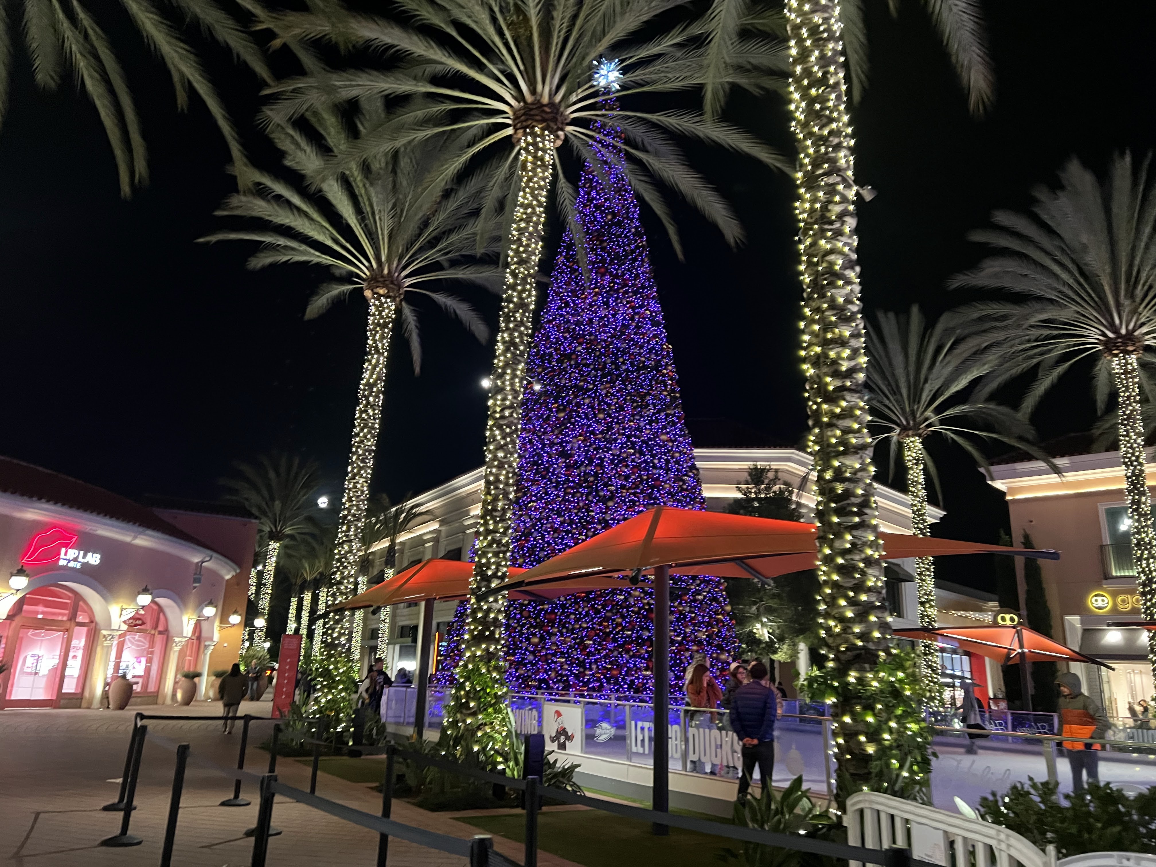
1. Since Christmas is coming up, the first picture captures the essence of the holiday especially since it's next to an ice rink. it definitely gives off the vibe and it presents it perfectly with the lights on the trees on the side and the big christmas tree next to it. It's in the middle of all the stores surrounding it as well so it does attract a lot of attention. i personally am not a fan of the purple color. although it does change color to a red and purple overtime, it's missing a variety of colors to show the holiday spirit.

2. This store is called Lip Lab. I feel like this store was very successful in the design on the interior and exterior. the color and overall theme is red and it's a strong energy that attracts the eye. it also has a white/cool light to support the red and blends the store into a pink design as well. There's also a big red lip LED light in the front store. It's simple and attracted me from far away.

3. This store is called Honey & Butter Macarons. There are plants displayed inside the store which attracted me but i would have to walk slowly and really look at it in order to notice it. There's a good amount of pink color and some blue LED lights inside but since the light is really dim, it's not enough to attract the customers. Although it could be their aesthetic but i don't think it was a successful design. i feel like it may need more white light to support the design and color of the store. The lights on the ceiling are a bit high but not enough to reach the floor or any objects in the store. For example, if a store is displaying shoes, you want to make sure the lights hit the shoes to highlight the colors of the shoes. You want to grab the customers attention when they walk by or from far away.


Friday, November 11, 2022

Week 7 - Yinqi - Irvine Spectrum - Site Specific


Overall Environment: The lighting of the Irvine Spectrum creates a sense of modernity and fashion. The pinkish lavender color makes the whole environment glow yet still blends at night. The green and yellow add freshness and energy. It provides a futuristic sense. The coconut trees are decorated with and become the main sources of light sources.The light seems to reinforce the symmetrical structure of the architectural design. The different colors between the stores and the ferris wheel also frame and enhance the space (the former being rectangular and straight and the latter being circular). 


Successful Store: I Think the Subway Store looks successful. It captures the brand’s signature colors: green, yellow and white. The LED lights sketch out the “S” shape on the window. And the background behind the Logo is mainly green. This design is not only eye-catching, but also gives me a feeling of health and swiftness. I think I can get some healthy, nutritious food from the store quickly. 


Failed Store: The name of the store "KEVIN JEWELERS" upon the entrance is lit with cool bright LED light. I suppose the intention is to create a diamond like sheen, but it makes me feel like a sports store. In the store, All the down lights are hung on the ceiling, forming two rectangles. Though the similar lighting structure also appears in museums or art galleries (I guess this might also be the intention of these downlights? To make their product look like precious artworks exhibited in the counter), but the overall environment is too bright. The lights above, without being covered, turns the whole store into a poorly decorated warehouse. The lights within the counters also compete with other lightings in the room. The whole space looks a bit messy and cheap. 


Thursday, November 10, 2022

Blog 7: site specific - danny

 On November 12th I visited downtown Disney 

The overall theme I saw was "old school America". It reminded me of movies where we can see small towns in the 1950s and 1960s where you can find everything you need by going along one main street. I saw a restaurant with live music and  Louisiana food and decorations, toy stores, clothing stores, a burger joint and even some Christmas trees (less than a week after halloween) 


I noticed that the stores with the least amount of people had white walls and white bright lights, usually the lights where hanging from above coming down on a straight angle and sometimes there would be some smaller lights focusing on the products. A specific store that suffered from is ironically Wonderground Gallery (it was not wonderful nor grounded at all). I think in this store the main theme is money: the designers most likely wanted to focus on the products and how expensive and unique they are. 


A store that also had some white walls but had much more success in implementing color is the Lego Store: I saw a lot of yellow, creating this illusion of a perpetual sunny day. I noticed the lights were pointing at different objects in different angles and there are some huge windows near the sealing that during the night function as opaque mirrors. 

I think this store is very successful at playing with size: the "toys" (lego statues) are huge and make you feel like a small child. The store was packed. 


Sunday, October 30, 2022

Week 5- Ari Pulido- Cat Movement


 Cat Movement


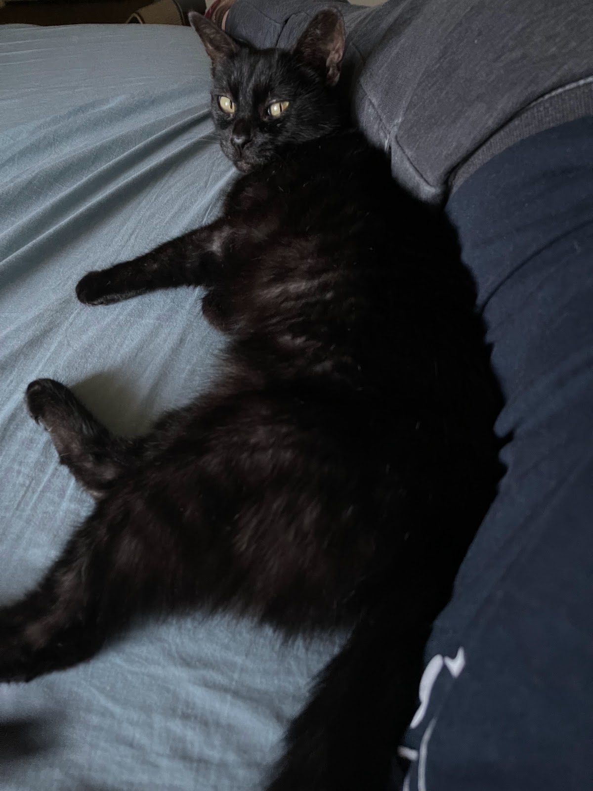
The inspiration for this was my cat Kea who loves to lay on top of me.  I chose to take a picture of her because she was giving me a cold stare.  Speaking of cold, this picture was taken at 5:45 pm today which gave the cool natural light coming from the window.  The blues in the picture also help keep the photo in that cool range.  Kea's eyes are warm in the photo which makes them pop on the blue background.  I enjoyed the movement that was done by Kea in this photo.

Week 5 - Waves - Maggie


         This picture was taken at Laguna Beach on a sunny day. It was badly taken but I think it could still reflect the movement of the sea waves. They just kept going and going, nonstop. The picture, however, only captures a fraction of that moment, but our eyes can interpret the main object to be continuing its movement. Imagination, or maybe the knowledge that we learned and are accustomed to (we know the waves can't stop), makes our perception very smart and agile, so we can see movement in a still picture. 
         I'm reminded of the posters for New Slate, where the dance movements also seem to move within the picture, because we understand momentum and the intention that are shown in the picture. So the eyes really do a lot in our perception of the world and ourselves, by instilling a lot of information into what seems like a simple image in front of our eyes. 

Week 5 - danny - frozen movement

 I took this picture while on my way home from school 

As always I was on  a hurry trying to leave as fast as possible and was trapped by a stop light, I looked to my left and I was fascinated by the color pallet outside my window. I usually leave school when it's fully dark outside, and because of my tired eyes and dirty windshield I don't pay much attention to the lights outside other than to say "there's a car right there" but this time I saw the cars with their lights, usually so bright that they hurt my eyes, this time those lights seemed so dimmed compared to the magnificent sun already almost out. I noticed the greens and browns of the trees that still remain and the orange and yellow slowly darkening. I tried my best to take out my phone and take as many pictures as I could before the next green light. This was my favorite 


Week 5 - Yinqi - Candle Light - Movement

I filmed this short clip when I observed the candle light in my apartment during daytime. The flame sways softly. The light around it also shifts with its own rhythm. The wax, melted around the candle, provides another surface to reflect light. The color of the jar is dark brown and its surface is frosted. The light is held within the. It is concentrated in this small space and creates a gentle and warm ambiance. I can feel how the light occupied the space and thickened the air. With heat being generated from the candle, the air becomes so juicy.

The “movement” of the flame is so delicate that I wish I could dance in that way. At the center of the jar, the flame looks like a real dancer. In terms of concert performance, the body of the dancer usually receives lights from other sources. What if the body of the dancer becomes the source of light? I had an idea to experiment for my new slate choreography (it is denied because of technical issue...): putting iridescent glitters on dancers' bodies. When they dance in the dark with flowing movement on the ground, they could look like dim lights from afar.


Saturday, October 29, 2022

Week 5- Reflection in Shadows- Emily


 I was working on my laptop with my back to a window when I saw the reflection of my screen lighting up the wall next to me. When I waved my hand in front of it, I noticed that two shadows appeared: my actual hand and the reflection of my hand in the screen. This was an interesting phenomenon and something that could also be used in a performance space. With a reflective material you could create interesting images using multiple shadows. It would be cool to choreograph the shadows as opposed to the bodies dancing and might be a fun way to collaborate with a lighting designer and set designer in the process. 


Sunday, October 16, 2022

Week 3 - Julian Xiong - TV LED Lights

 Recently I've been using this blue LED light during the night. I think I'm just attracted to cool lights. I don't even turn on my ceiling lights because it's a warm light and it gives off too much strong energy especially during night time even if I dim it. Cool lights feels relaxing and calming to me after finishing a productive day. I personally like how this blue light brings out the shadow and silhouette of the everything around it. In the past, I've changed it to purple and sometime green and I enjoy it a lot more than if I were to turn it to red or yellow. As we learn more about warm and cool lights, each color makes me understand more of the energies it gives off in the space.


Saturday, October 15, 2022

Weel #3: AP - Pubbing it out


I chose to us this photo of the UCI pub around the hours of 4-5 pm this past Wednesday.  The day wasn't completely overcast, but the weather was finally starting to cool down this past week.  I enjoyed the combination of warm tone, cool tone, natural, and saturated colors that came to play.  In the background you can see the cool tone colors come into play from the window shining in with the natural day light, creating a cool toned atmosphere.  The saturated cool tone colors come from the neon blueish purple light in the lefthand side.  There is also a hint of saturated green popping out on the right side of Julians face and about Dannys glass.  But for the most part the warm tone colors really come into play with the hanging lights, dark yellow walls, and the color of the drinks.  The front  left hand side of the image was dark, which made all of the lights from all angles really pop out.  I also really enjoyed the redness of Dannys hand that was lit by the buzzing sound of the monitor beeping that our food was ready.  This really shows the aspects of combining lighting tones and moods to create a fun and vibrant atmosphere.
 

Week 3- Emily- Playing with Shadow


 In this picture, there were two main sources of light creating this look: An outdoor flood light from the apartment building behind the camera, and a Blue Light Emergency Call Box to the left of where I was standing. Both sources of light were hitting this tree, but the brighter and warmer flood light was washing away any blue that might have been visible on the trunk of the tree or the wall behind. However, where the shadows fall, we can see the vibrant and saturated blue/violet very clearly. If the tree were our dancer on stage, this might be an interesting way to bring color and vibrance onto the floor of the stage, particularly in studio 1100 with a gray floor. It could present as a more full and energetic setting.

Week 9 - Julian Xiong - Passion

 This is a picture of my plant. I have a big hobby of taking care of plants so I came to love cool lights that has over 1000 lumens. It'...